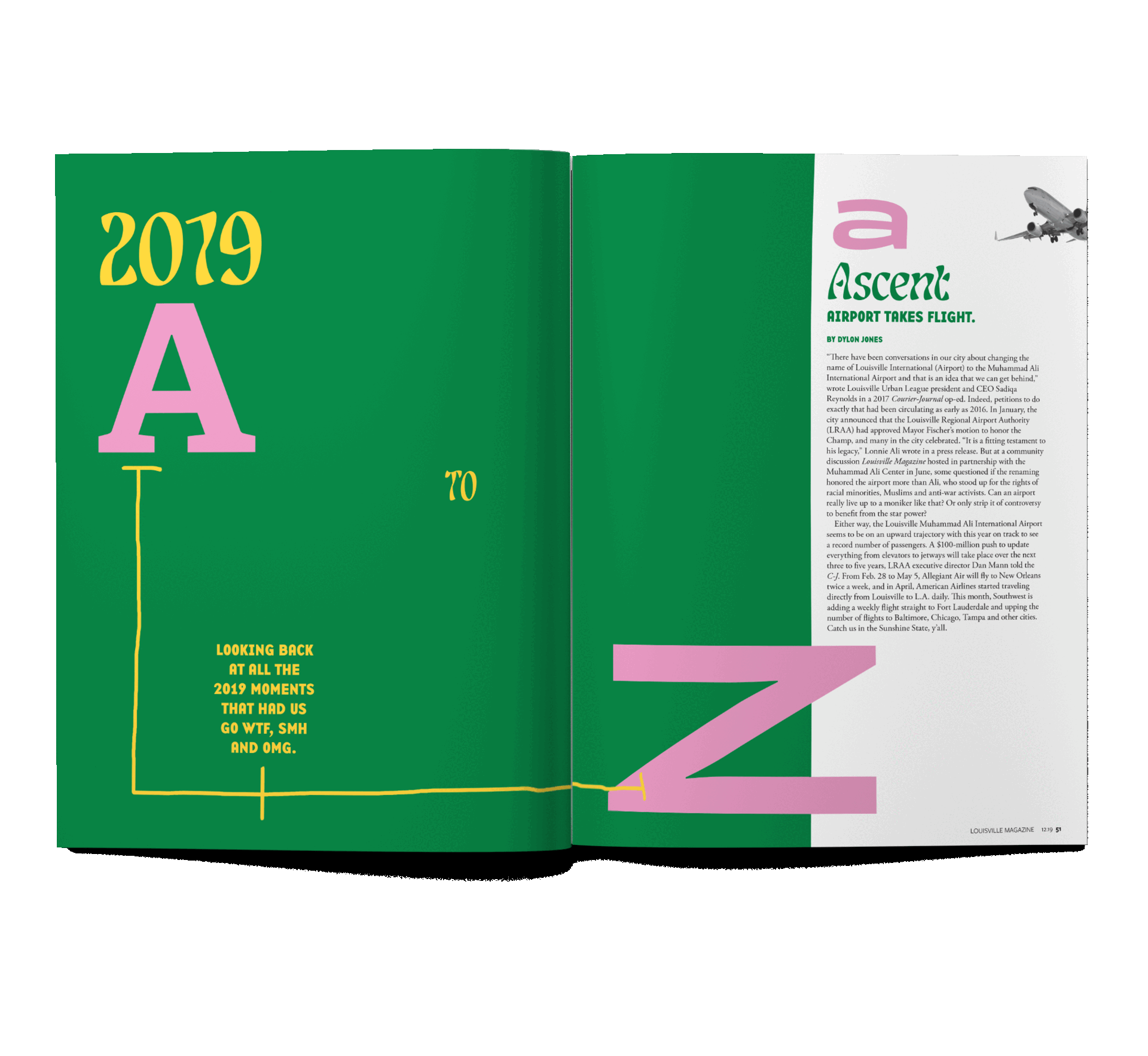
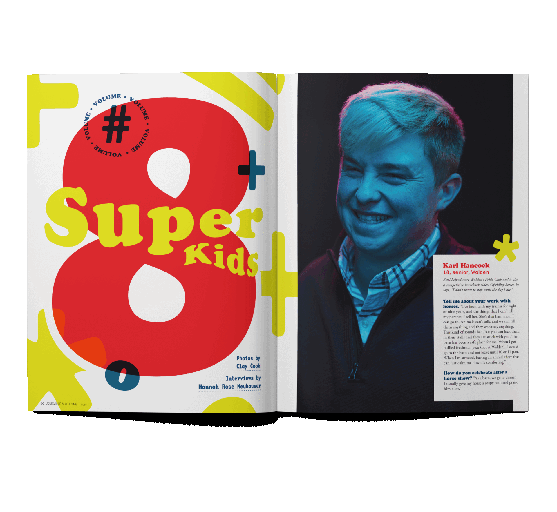
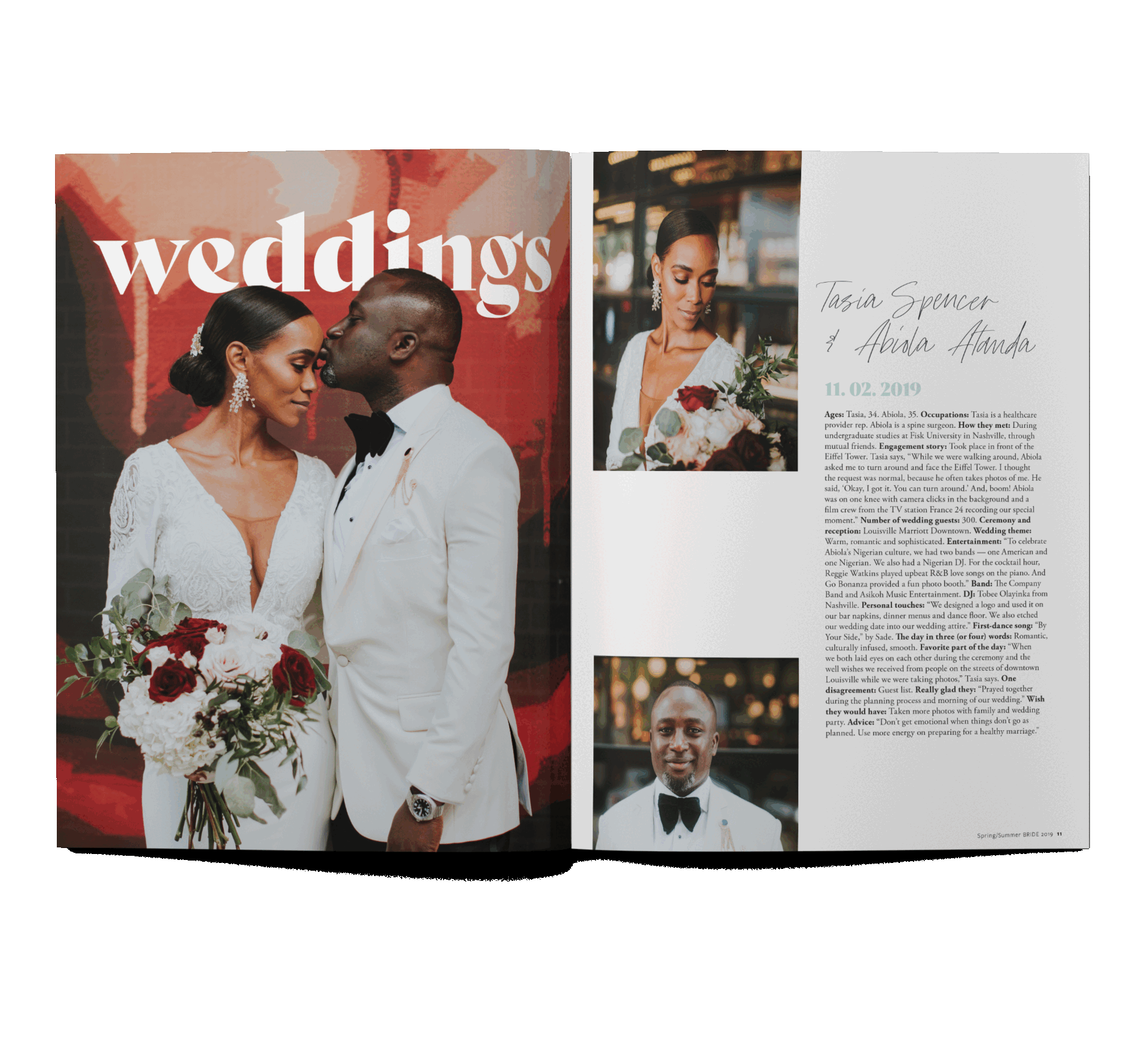
Editorial Design

A good cover designer does these three things: (1) doesn’t play on stale stereotypes, (2) makes the subject matter instantly recognizable at both thumbnail size and at 10 feet away and (3) finds the twist, punch, weirdness or sexiness of the featured subject to shock, intrigue and unexpectedly communicate the magazine’s take on a given idea. Each magazine I work on holds these values close and is the backbone of the design process. Let’s let the design experimentation begin and be curiously creative!

Louisville Magazine, ‘No Justice, No Peace’

“No Justice, No Peace” is a design package made up of two photo essays and a transcribed roundtable conversation featuring several prominent leaders from Louisville’s Black community. When I came into the picture as the freelance art director and designer, the conversation was about to take place and the photography had already been assigned. The photography that came into my inbox was mind blowing, and the final copy from the roundtable stopped me in my tracks. I knew once I read some of the suggested pull quotes that this design was going to be heavily type focused. I didn’t want any fussy or overly-designed designs to muddy up the honest language and vulnerable viewpoints. This design package won Editor’s Choice at the 2020 PRINT Awards and the cover design received international acclaim on Cover Junkie.

Role: Art Director + Designer
Cover art created by Aldrena Corder
Photography by Mickie Winters + Andrew Censi
Martin Typeface by Vocal Type Co

Puff Puff Magazine, Unicorns & Daydreams

Puff Puff is a semi-annual love letter to weed, good art, and wonder. Inspired by convivial puff puff, pass smoking circles, and the Nigerian delicacy of the same name, Puff Puff connects your little girl self with the woman you are today. Experimental, playful, and mind-bending, this magazine design allowed me to trust my intuition and the process of making. This magazine project allowed me to stretch my creative muscles by creating vibe-y and flowy gradients and layering images to create conceptual collage art celebrating women and weed. 

Role: Art Director + Designer + Collage Artist

Louisville Magazine, 'Cover to Cover'

The mantra for this issue was more is more is more is more. This usually isn’t my design ethos but boy did it feel good to throw everything and the kitchen sink on the page. The team at Louisville Magazine took a deep dive into the mag’s archives and asked Louisvillian’s to comment on one cover from each of our 70 years. The big question was how to design a cover about covers. Super duper meta, right?! Our archives showed us that we are stillllll writing about the same things over and over again just with a new generation. Housing. Derby. Green spaces. Urban Planning. Racial divides. It's all a twilight zone of important topics that never seem quite solved, just evolved. We just keep circling over and over again. So, using past covers, I hoped to create a tunnel, a ripple, our city’s own twilight zone. 2022 AIGA Louisville’s 100 Show Award Winner!

Role: Art Director + Designer


Louisville Magazine, 'Louisville needs you'

The guts and courage it takes for a magazine to have a quiet, reductive cover. It's powerful in its quietness. It's intimate and human. It's a great representation of the pages within where the reader is author, curator, historian. The budget and timeline for this issue were severely lacking. The major design hurdle was designing a magazine (or really workbook) where the audience creates the content. I worried the design would be boring and the readers uninterested. But using some scrappy-ness and a can-do attitude, I designed a world that allowed ample white space but was still engaging.

Role: Art Director + Designer


Louisville Magazine, 'Home'

After many conversations with the editor at Louisville Magazine, we realized the quiet confidence that the city of Louisville exudes. The design of this issue embodies that motto. From its muted color profile, lots of beautiful white space the design allowed the words and images to speak and sing first.

Role: Art Director + Designer


Louisville Magazine, 'Tribute to Food + Drink Industry'

This issue takeover was a thank you letter to the workers in the food and beverage industry and what’s the most Louisville way to say “Thank you and job well done?” Well, how about a blanket of roses in to-go food containers? Using bright color and some bold headlines, I let the words shine and give a hopeful and prideful vibe to the pages. The food photography was directed to be messy and greasy and warms readers eyes and bellies. The illustrations were guided to be fantastical and grand to showcase the weight and asbustity of work in the food and beverage industry during a global pandemic. Mitch Wisen won ‘Best in Illustration’ for their work in this issue at the 2022 AIGA Louisville’s 100 Show!

Role: Art Director + Designer
Photography by Sophia Mobley
Illustrations by Mitch Wiesen + Liz Richter


Case Study

Louisville Magazine Cover, ‘No Justice, No Peace’

As a Louisvillian and a designer with a highly visible publication like Louisville Magazine at my fingertips, the ‘No Justice, No Peace’ issue weighed heavily on my mind and spirit. How could I, as a white woman working with an all white staff, begin to articulate the visual language of Breonna Taylor? This case studies explores how Aldrena Corder sewed this iconic cover artwork that gained international acclaim and was a beautiful testament to Black women everywhere.


Louisville Magazine, ‘26 x 26’

In this issue, 26 Black women in their mid-20s talk about life beyond 26. The team at Louisville Magazine wanted every single one of the 26 women to be on the cover. So they are. This issue has 26 different covers all designed with honor by yours truly. This was a massive design project to create a visual identity and system that was recognizable as Louisville Magazine but also to give some personality to each woman gracing the cover. The hed and dek were custom flowed over the lines and contours of women’s portraits. The black frame brings the eye straight into the image so you’re locked into their world and will listen to their powerful words. Our flag was even reduced to give the women the coveted cover space they deserve. The inside provided ample white space, was designed on a grid but provided pivotal bits of movement through selected pull quotes.

Role: Art Director + Designer
Photography by Charlee Black


Louisville Magazine, ‘Super Kids Issue’

“You. Crushed. It.” This phrase was emailed to me by the editor of Louisville Magazine after I sent the first round of design proofs for the Super Kids issue. Using the Stranger Things inspired photoshoot as a visual guide, I employed bright elementary colors, base mono typefaces and math symbols to create dynamic spreads for the feature well. I even dared to put text upside down on the cover to mimic the design of brain busters of yesteryear. I took some big risks and it paid off.

Role: Designer
Photography by Clay Cook


Louisville Magazine, ‘Derby 2022 Issue’

For the 2022 Derby issue, the folks at Louisville Magazine wanted to turn this issue on it’s head. Looking beyond the standard gallantry, sportsmanship and fashion of the Kentucky Derby, local parents interviewed human three-year-olds (the same age as the horses running in the actual Derby). The issue needed to sit on the spectrum between celebratory and curious while being both high-brow and low-brow. It needed have ‘thummmmp’ factor (this book ended up being 300+ pages and checked this thump factor unequivocally.) The interior layouts are nods to the Derby day race programs and the color profile reads as both spring-like and a nod to the saddle cloth color markers. Featured here are a few interior spreads and covers that were in the running for the final package.

Role: Art Director + Designer + Stick Horse Photographer


Louisville Magazine, ‘Punished Issue’

For this cover, I explored many visual interpretations. Some of my favorites were a studio shot of a flat lay baby orange jumpsuit and a studio shot of a kid’s prison birthday cake but after conferring with the writer and editor, I designed a cover that kept a simple color profile with an ‘out of reach’ blue sky just beyond the barbed wire. The large wall is made of scanned paperwork indicating the amount of paperwork usually found in a Black teens record which ultimately prevents them from reaching freedom under the blue sky.

Role: Art Director + Designer


Louisville Bride

Whether a wedding has a man and woman or two folks of the same gender, every wedding should feel romantic and elevated. It should feel celebratory and spiffy. Using a ‘Louisville’ friendly serif and a romantic script, ample white space and gold leaf, the design represents all Louisville weddings.

Role: Designer


San Antonio Current, Selection of Covers + Interiors

Operating as a one woman art department, I wore many hats and did some weird shit while at the Current. All for the sake of the cover, I once piled baked goods on my food and nightlife editor’s face while she was camped out on my living room floor and the news editor once found me washing up some tiny troll laundry at my desk. Hand-lettering, illustration, digital collaging, analog making, nothing was off limits! From concepting wacky covers to laying out a 48+ page book in just a few days, I was scrappy with zero budget and boy did I have a blast. I had the opportunity to work with a team of writers and publishers and also find, hire and manage a collective of kick-ass creatives. Featured here is a selection of my favorite covers and interiors.

Role: Art Director + Designer


The IG Grid